
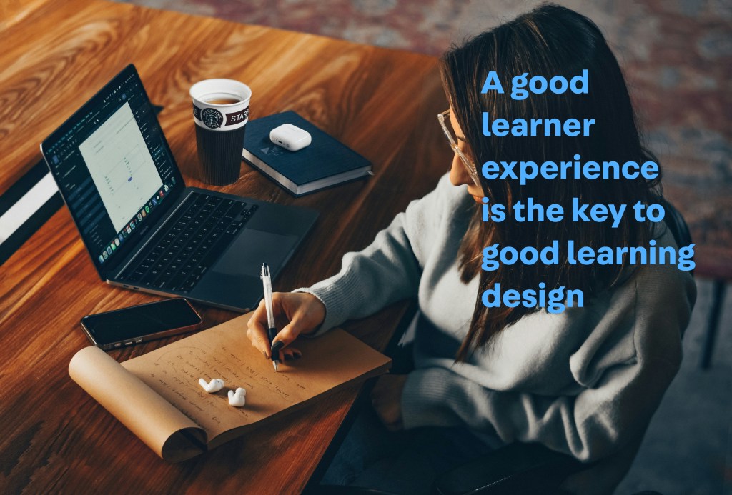

When I’m not in front of my learners, my favourite phrase for lesson design is: How can I trick them into learning?
Now that I’ve given that away and await flaming online, let me explain what I’ve learned from that.
I’ve learned that wanting to trick them into learning is, in effect, a form of UX design.
- It’s about thinking about what you want the learner (user) to do – and how to make it easier for them to do it.
- It’s about thinking about the learner’s (user’s) experience – and how to make it delightful.
- It’s about thinking about the learner’s (user’s) journey – and how to make it flow.
As a learner, I’ve wanted to
- Throw away learner guides that were not formatted properly (they let the page break cut across a table of critical information)
- Walk out of classes where the lecturer is just reading off the slides (couldn’t I have done that at home?)
- Quit classes which only tell you where the location is in one small little line of text that’s easily missed
And that’s exactly like poor UX design.
- When an app makes you press five buttons just to quit it – why don’t I just Force Quit the damn thing?
- When a website starts to play music that I don’t want – why don’t I just close that tab and visit something else?
- When I’m talking to one of those lousy chatbots that just leads me in circles regarding the answer – I don’t feel I want to grab on to this journey anymore.
So it’s made me realise that good lesson design – is really good UX design.
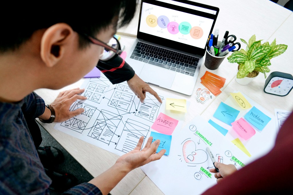
But wait, what is UX design?
User Experience (UX) design is all about designing things to make them easier and more enjoyable for people to use. We usually use it to refer to designing apps and websites, but it can also be about UX for physical products and services. Think about the best pen that you love to use. That’s an example of good physical UX design.
As a scriptwriter, I find it’s about leading the user down a journey – through a story.
Education is the same. You’re guiding learners through an experience. That means you are:
- Sequencing the learning units in a way that makes the most sense
- Reducing the friction in learning and absorption of the material
- Supporting memory retention and stickiness
- Designing for emotions, to reduce friction and support retention
“Design is really an act of communication.” – Don Norman, the father of UX design
And here’s how it applies.

Sequencing through the user flow of learning
Cognitive science shows that well-sequenced instruction helps new information to “stick”, while a messy, poorly thought through lesson leaves everyone (including the educator) lost.
It’s like building a new Lego set. The instructions show you, step by step, what you need to do in order to build that Lego set. Start at Step #77 and you’ll be confused. It’s carefully designed to help you go in order – and also to help you build the foundations first, before you add the more complex information.
That’s the same for UX-driven sequencing of learning. You probably apply it already, and here are some techniques that will improve your sequencing:
- Backward Design: Starting with the desired results (also known as intended outcomes, achievement targets, or performance standards) is to start with the end in mind. Mapping learning activities to get there (Wiggins & McTighe, 2005) is a form of backward design. If it doesn’t serve the intended outcomes, then it doesn’t have a place in the lesson.
- 5E Model: This refers to Engage, Explore, Explain, Elaborate, Evaluate (Bybee, 2015), a model of instruction that maximises curiosity and sense-making.
- Spiral Curriculum: This means to teach the complex ideas at increasing levels of difficulty, starting from the basics to the highest level (Bruner, 1960). By revisiting the same topic at different levels, the recap-loop makes the learning more sticky. Singapore’s Mathematics curriculum uses this (think of Fractions).
If you’re more traditional, you think about it this way – where do the learners start and what do they already know? This aligns with Gagné’s Nine Events of Instruction (Gagné, 1979), where Event 1: Gain attention of the students is where they start, and Event 3: Stimulate recall of prior learning maps to what they already know.
For me – when I develop teacher training programmes, I’ll ask what the intended outcome is. It could be to pass a test for a global certification, or it could be just about being able to educate effectively. Based on this intended outcome, I’ll use backward design so that the teacher training programmes can meet the learning outcomes.
I start my learning session swith something interesting, related to real-world events, or a surprise – which aligns with the start of the 5E Model (Engage) and Gagné’s Nine Events of Instruction (Event 1: Gain attention of the students). I also use Spiral Curriculum by seeding the concept during icebreakers, before getting them to match ideas in the concepts, and then getting them to create new material with the concept (climbing up Bloom’s Taxonomy along the way!).
UX design for retention
If you have a relatively modern phone, going back to the Home Screen is just a swipe up. You might not even consciously remember it – but when it’s time to go back, you remember exactly what to do. That’s good UX design that helps you remember what to do to use your phone.
And that can be applied to education as well. These are some techniques that will improve retention:
- Chunking: Breaking information into bite-sized chunks (Miller, 1956) helps to make it easier to remember. It makes sense – kids don’t remember the entire Pokedex in one day, it takes the introduction of one Pokemon at a time to help them remember it.
- Dual Coding: Pairing words with visuals (Paivio, 1971) is more effective than using either one individually. It engages more parts of our brain, thus improving the stickiness.
- Repetition with Variation: Revisiting the key idea in different ways (Bjork & Bjork, 2011) not only sneaks in repetition, it’s also an expression of spiral curriculum seen earlier.
It also turns out that the reason why some ideas survive is (Heath & Heath, 2007) because we remember:
- Surprising facts
- Stories and anecdotes
- Contrasts and vivid examples (like controversies)
- Context that we can relate to
- Content that we can manipulate and interact with
It bears great similarity to the expository essay introduction types that I often teach.
And to show how this works across different disciplines – my trainer frequently talks about disguised repetitions, which follows my ethos of “tricking people into learning”. In his context, it’s about getting in more reps to build muscle, which is also a form of muscle memory, ie. learning for your muscles.
For my learning design, I try to keep to 200 words for each “chunk” of information, before changing formats. This means that I’ll vary it with boxes, bullet points, prose text, or tables, and ensure the information doesn’t end up as a wall of text or a gigantic list of bullet points. As far as possible, I’ll add pictures, photos, or icons to information for dual coding (helps with visual learners too!). And when I use an icon, I’ll repeat its use when I revisit it at a higher level in a handout for repetition with variation.

Embodiment: holistic engagement is holistic UX
Unless you have telekinetic abilities (and even so, you need to have literal fine psychomotor skills to manipulate the things you are telekinetically touching), you need to use your body to express what you’ve learnt. That also covers writing (pencil grip and penmanship), using a computer (typing, mouse control), or mobile devices (finger swipes and taps).
This is embodied cognition – which is how our cognition is shaped by our bodily state and physical capacities. Basically, it’s not just the mind that learns, it’s the body that learns too.
- Embodied Cognition: Include movement (scavenger hunts, card sorting), roleplay, real-life simulations, and tactile materials in your learning design.
The protégé effect also tells us that we learn more effectively by teaching information to other people, even if other people aren’t less knowledgeable. Basically, doing it is much better than just reading or listening to it. Employing it improves learning (although it may be time-consuming).
- Protégé Effect: Get learners to teach what they’ve just learnt to each other through reflections, oral sharing, gallery walks, or roleplays.
And finally, for everyone who uses Kolb’s Experiential Learning Theory (Kolb, 1984) – you know that it’s a entire cycle of doing, reflecting, conceptualising, and then experimenting that is involved. This is embodiment in action – because it’s not just passive absorption, but active learning.
- Kolb’s Experiential Learning Theory: Ask how they might use this theory tomorrow to tap on all four aspects of the cycle.
As much as I feel uncomfortable with leaving a large blank unstructured box for reflections – I do it in my handouts because it’s an important part of Kolb’s Experiential Learning Cycle. For my positive psychology workshops, I always use colourful cards as part of the learning to help with embodied cognition. And for corporate training where there’s a lot of dry information to absorb, I assign different chapters of the topic to different groups to teach the rest of the class, to use the protégé effect for the whole class.

Accessibility and inclusivity is good teaching and good UX
We’re all different, so acknowledging and building for our varied styles and abilities is vital. Not only is it kind to do so, but it is efficient – it means that your learning materials benefit more people.
In Singapore, there’s the very basic and ingrained mentality that all cultures are represented in learning materials. But it goes beyond that – all industries should be included as well (I read a specimen paper for a watershed examination that implied that Singapore lacks a certain industry that certainly exists). I believe that all identities should be catered to as much as possible, as well as different body sizes and abilities.
Of course, learning styles and preferences are important to account for (like VATK [Visual, Auditory, Reading/Writing, and Kinaesthetic] learning styles). But for me, it’s also important to understand learning disabilities as well – such as dyslexia.
So when it comes to formatting, I try to vary modalities (bullet points or prose text) to cater to a wider variety of learning styles. For tables, I make the effort to ensure each row is a different colour to improve readability, and I use icons to link similar concepts together to make it easier for those with learning disabilities. Besides, it’s just good UX design that also improves stickiness and retention.

UX-inspired tips for smarter learning design
So what can you do to improve the UX design of your learning design? Here are my suggestions.
1. Signposting
Regardless of whether you’re saying it or putting it in writing – it’s important to make your transitions clear. Verbally, you can use phrases like “next”, “now we’ll do XXX”, “before we go on”, just to let the learners know where you are. In handouts, putting a little progress bar shows where learners are in the handout, as well as using headers. And slides could always benefit from the session overview and showing learners which part they’re at.
2. Adding space – like white space
I am also uncomfortable with leaving large swathes of white space (mainly because I want to start a new section on a new space). But this white space is important because it gives learners the space to write notes, take a breather, and just have that extra room to customise their handouts.
White space is helpful. Don’t shy away from it.
3. Use scaffolding and independent feedback loops
Scaffolding is understandable – add hints, guided examples, and clear demonstrations to improve your learners’ ability to become competent at the skill you’re teaching. More help and guidance is better than less. It’s like the Help menu selection in apps.
But building independent feedback loops is something that’s not considered as often. It usually comes in the form of adding the answer key so learners can check their own answers. We often think it means that we’re given them the answers – and yes, we are. But it allows them to check and get feedback about their answers, and also helps them to do error analysis as they figure out how they went wrong.
4. Stick the landing
I was talking to a friend about movie theatre UX – how certain cinemas just dump you in a hot, ugly, stuffy stairwell after the movie ends (instead of providing a comfortable way back into the mall). This leaves a sour taste in your mouth, because the last thing you remember of that cinema is that it’s uncomfortable.
Similarly, ending your lesson well is important. Don’t just have your lesson peter out – end it with recollections, reflections, and something fun. It’s not always possible because of adult schedules or perhaps the final task doesn’t allow for that. But where possible, get your learners to think about they’ve learnt – so that their last experience is an educational one.
5. Begin with empathy
UX design is all about understanding the user. So including a pre-lesson survey is helpful in knowing your learners. Find out their demographic, their learning styles, their goals – and you can tailor your learning design into something that’s useful for them and fulfilling for yourself.
As an educator, it’s hard to remember what it’s like to be a learner. That’s why I’m always taking a course or learning something, so that I can empathise with the learners and design better lessons for them.
6. Be clear and explicit
You can never be too clear. That’s because people will inevitably miss what you expect them to notice. Good UX design builds redundancies in – multiple ways to achieve the same objective. Similarly, your lesson design should build redundancy in, so as to ensure that learners who miss something out earlier are still able to complete their learning, because you’ve added that information later on.
Being clear and explicit is the easiest way you can improve your learning design.

All learning designers are really UX designers
Curriculum writing isn’t just about “fun activities” or “information download activities”. That’s looking at it from a modular point of view.
But good – nay, great lesson designers understand that each unit of learning doesn’t exist in a vacuum. Learning is a journey. Learning is an experience. That’s why you need to design the experience. That’s why you need to be a user experience (UX) designer when designing lessons.
Your learners will thank you for making it fun to be smart.

References
Bruner, J. S. (1960). The process of education. Harvard University Press.
Paivio, A. (1971). Imagery and verbal processes. Holt, Rinehart & Winston.


Leave a comment